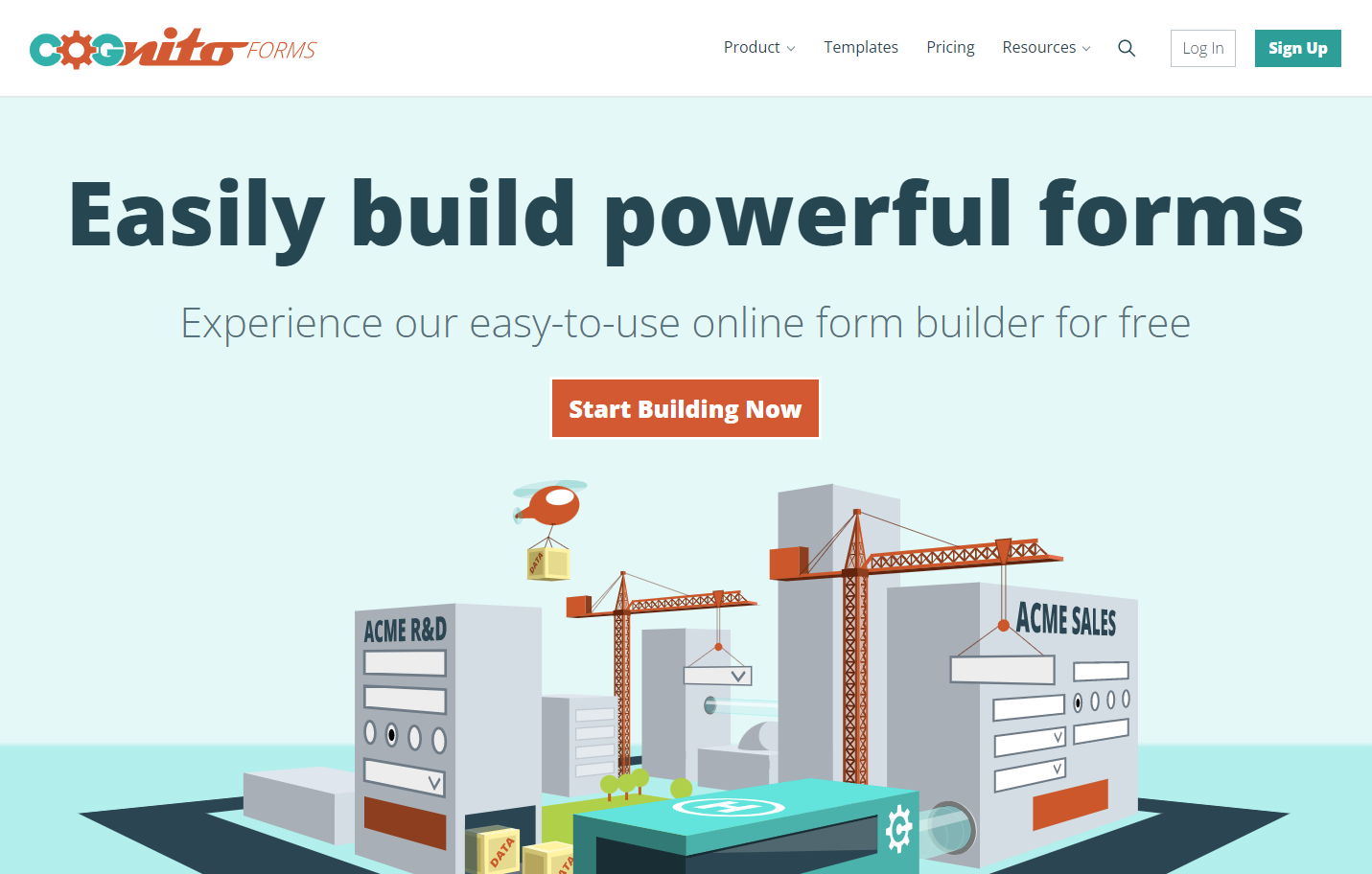
Cognito Forms Launches New Look
We’re excited to present our newly refreshed website!
We feel this updated design better reflects who we are and what our platform is capable of. It also celebrates our users and embraces our position as one of the fastest-growing form builders available.
Here’s a little peek into why we made the changes we made.
We’re all about making the complex simple.
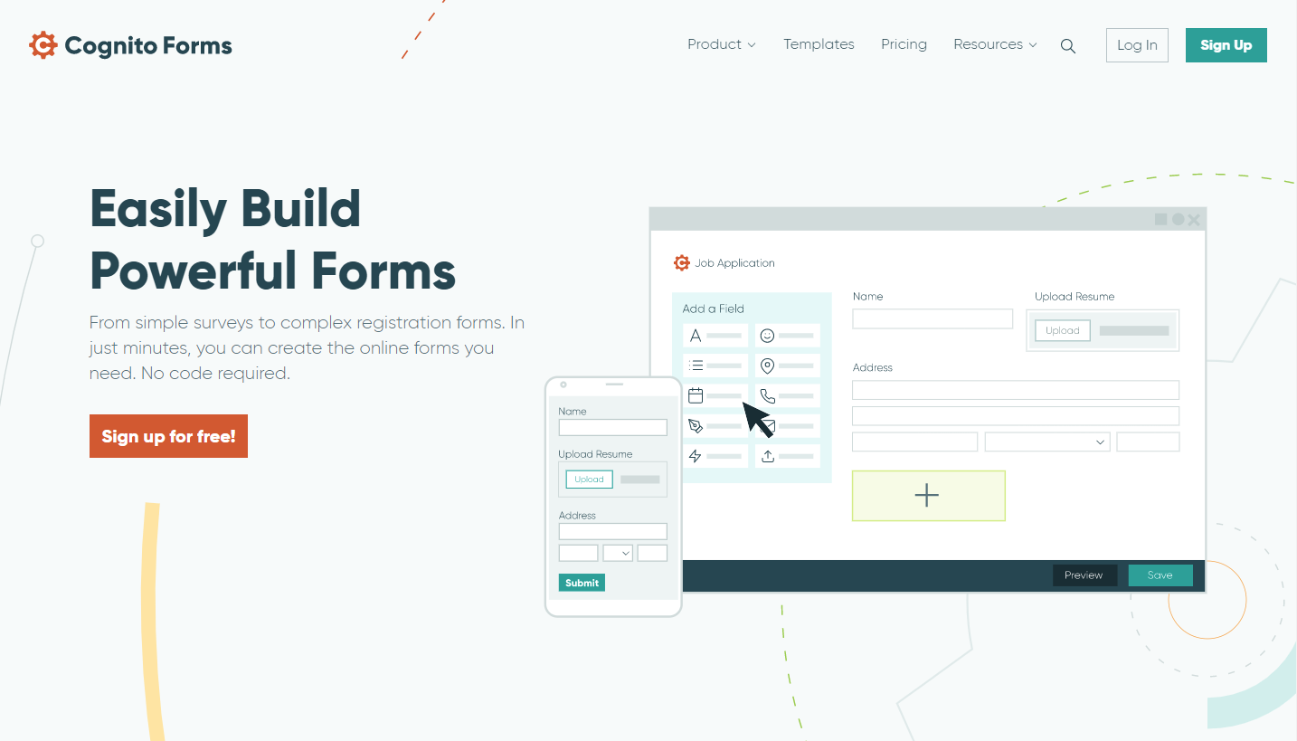
You’ve probably already noticed that our new site features a cleaner design.
That’s a manifestation of our ongoing pursuit of simplicity. After all, our driving purpose is to help you simplify your work. And for that, you need simple tools that can do your complex work for you. So, we make our platform simple to learn, simple to grow with, simple to subscribe to.
The concentric circles you’ll see throughout the design are constantly in motion, yet never a distraction. They’re a metaphor for the role our platform plays in your work life: your forms and automations are always working for you behind the scenes.
The clean design reflects the ability our platform provides to help you simplify, automate and better organize your work.
The content you rely on for reference and support is exactly where you’d expect to find it.
And our users are featured prominently on the home page. Because you’re the reason for everything we do.
It’s that simple.
A new look deserves a new logo.
While we were simplifying our site, we took the opportunity to give our logo the same treatment.
Our new, simplified logo maintains the same cog imagery, while creating greater impact by being easier to read (especially when it’s small or in one color).
Again, you see the same theme repeating – the more we simplify things, the more effective they become.
It’s a philosophy that applies just as well to logos as it does business processes.
Of course, all of this change is not intended to say that there was anything wrong with our previous design. It was just reflective of our platform at a different time in our development.
A final look back at our original website.
Our original site had the look and feel that represented us well as a startup. When we designed it, we were just setting out to build a tool that simply didn’t exist anywhere.
We had an ambitious goal: we would create a form builder that could do more than just collect data. It would enable anyone to leverage and transform their data through a powerful calculations engine – one that would use an intuitive expression language and be easy enough for anyone to pick up.
So we launched. And we grew. And we added capabilities as we went.
In time, we found ourselves in a place where we’re no longer that same ambitious startup, but a mature tool used by organizations around the globe to power their own digital transformation.
Of course, we’re still ambitious. And we still have big plans for our platform.
So as we enter this new phase of our development, we’re doing so with a new look that represents the next phase of growth we’ll experience over the coming years. And we’re thrilled to have you growing alongside us.
We hope you enjoy our new look. And if you feel like it, drop our design team a note to let them know. They’ve been working hard for the past year to make this special, and I know they’d appreciate your kind words.