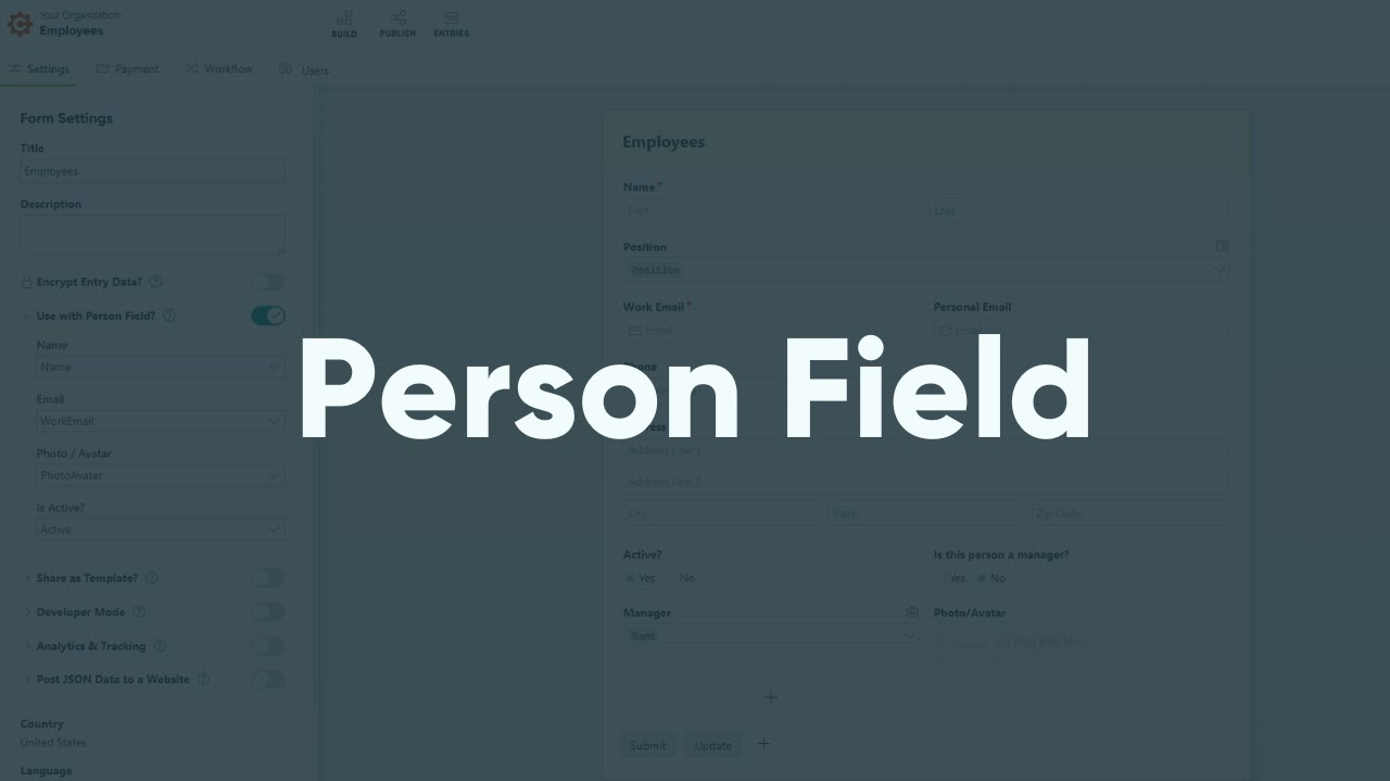
Simplify user management, onboarding, and task assignments with the Person field. Learn more about creating lookups with Person fields.
Label
The label will display as the title of the field or the question that is being asked on the form. You can select the icon on the right to hide the label on the form. You also can use the pop-up formatting toolbar to insert values from other fields on the form.
Values from protected fields cannot be inserted into the field label.
Type
The Type option determines how the list of people will appear on your form.
Drop Downs
Drop Downs allow users to select people from a menu. The user must click into the menu in order to see the full list of people.
Radio Buttons
Radio Buttons allow users to see the full list of people, but only choose one of the choices.
Checkboxes
Checkboxes allow users to see the full list of people and check all that apply.
Placeholder Text
Placeholder Text is a short prompt that describes the expected value of an input field. The prompt is displayed in the field before you enter a value, and disappears when you begin typing.
Look Up People From
You must be an Administrator of a form to look up data from it. We do not recommend making any sensitive data available through the Person field – the data will be loaded behind the scenes and could potentially be exposed.
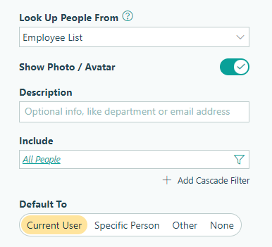
Select the source form from the list of available forms in your organization. Please note that:
- Once you save your form, the source form cannot be changed.
- By default, you cannot look up data from encrypted forms – you must specifically allow the entry data to be available under the form settings. However, if you set up a Person field prior to enabling encryption, the Person field will continue to work.
- The Person field will still look up data from forms that have been archived (but not deleted).
- When you delete an entry from the source form, the Person field value disappears. Likewise, when you delete a field from the source form that’s referenced by the Person field, that data disappears, and an error message appears in the Person field settings until you update the form.
- Instead of deleting data from the source form, we recommend that you hide the inactive options by filtering your choices.
- Once you save your form, an icon will display next to the source form on the forms homepage. If you hover over the icon, you can see exactly which form is referencing the source form.
When you create a Person field, you have access to all of the field data from the source form.
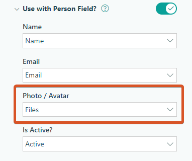
Show Photo / Avatar
Select this option to display a photo using the uploaded file from the source form.
Description
The choice description provides extra information about each choice value. It does not display as part of the value and will not be exported with the form. The description can include text as well as any data from any field on the source form.
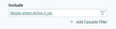
Include
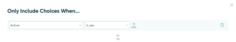
Use the Include option to filter the list of people based on specific criteria, such as their “Is Active?” status, which is determined by a Yes/No field. Learn more about filtering choices by active or inactive.
You can update the filter at any time, and when you change the filtered values, the previously selected choice value will still be there when you update the entry.
Cascade Filters
When you delete a Person field, any linked filter fields will be deleted as well!
You can select Add Cascade Filter to filter a subset of choices from the Person field:
The filtered list will appear in a separate filter field. Text values are displayed in alphabetical order, while numerical values (such as dates and numbers) are displayed in ascending order.
You can set the field type (Drop Down, Radio Buttons, or Checkboxes) and add up to three cascade filters to create a series of cascading lookups.
Default To
Automatically populate the Person field for the user. The user can then choose to change the default value before submitting the form.
-
Current User – Default the Person field to the currently signed-in user. This setting requires authentication for organization users when accessing the form via the public link.
-
Specific User – Select from a drop-down list of people to default the Person field to a specific user.
-
Other – Add a calculated default value using the basic editor.
-
None – Do not set a default value for the Person field.
Help Text
Help text can be used to assist the user by providing additional instructions. Help text will display directly under the field. Use the formatting toolbar to format text, insert hyperlinks and images, and populate values from other fields on the form.
Values from protected fields cannot be inserted into the help text.
Show This Field
By default, fields will always display on the form. However, you may want to hide specific fields or sections based on certain conditions, such as a selected value of another field on the form.
- Always – Field is always shown.
- When – Field will only display when specific conditions are met. After selecting this option, the Conditional Logic Builder dialog will display allowing you to select when the field or section should be displayed.
- For Roles – Field will display only when accessed via a role-based workflow link specific to the role(s) selected.
- Never – Field will never display.
Require This Field
Requiring a field will make sure the user provides a response. When a field is required, an error message will display, and the form cannot be submitted until a value has been added to the field. Required fields are indicated by a red asterisk next to the label. By default, fields are never required.
- Always – Field is always required. User must provide a response in order to submit the form.
- When – Field is required only when specific conditions are met. After selecting this option, the Conditional Logic Builder dialog will display allowing you to select when the field is required.
- For Roles - Field is required only when accessed via a role-based workflow link specific to the role(s) selected.
- Never – Field is not required. This is the default behavior.
Read-Only
Set fields and sections as read-only to create simple workflows with your forms. All fields can be made read-only, with the exception of fields that are already read-only by default (Calculation, Price, Content, Page break, etc.).
- Always – Field is always read-only.
- When – Field is read-only when specific conditions are met. After selecting this option, the Conditional Logic Builder dialog will display allowing you to select when the field is read-only.
- For Roles – Field will be read-only when accessed via a role-based workflow link specific to the role(s) selected.
- Never – Field allows user input. This is the default behavior."
Custom Error
You can set a custom error message that will display under your field when specified conditions become true. The conditional logic builder will allow you to add any number of rules for validating your field. Learn more about the custom error option.
Simplify user management, onboarding, and task assignments with the Person field. Learn more about creating lookups with Person fields.
Label
The label will display as the title of the field or the question that is being asked on the form. You can select the icon on the right to hide the label on the form. You also can use the pop-up formatting toolbar to insert values from other fields on the form.
Values from protected fields cannot be inserted into the field label.
Type
The Type option determines how the list of people will appear on your form.
Drop Downs
Drop Downs allow users to select people from a menu. The user must click into the menu in order to see the full list of people.
Radio Buttons
Radio Buttons allow users to see the full list of people, but only choose one of the choices.
Checkboxes
Checkboxes allow users to see the full list of people and check all that apply.
Placeholder Text
Placeholder Text is a short prompt that describes the expected value of an input field. The prompt is displayed in the field before you enter a value, and disappears when you begin typing.
Look Up People From
You must be an Administrator of a form to look up data from it. We do not recommend making any sensitive data available through the Person field – the data will be loaded behind the scenes and could potentially be exposed.
Select the source form from the list of available forms in your organization. Please note that:
- Once you save your form, the source form cannot be changed.
- By default, you cannot look up data from encrypted forms – you must specifically allow the entry data to be available under the form settings. However, if you set up a Person field prior to enabling encryption, the Person field will continue to work.
- The Person field will still look up data from forms that have been archived (but not deleted).
- When you delete an entry from the source form, the Person field value disappears. Likewise, when you delete a field from the source form that’s referenced by the Person field, that data disappears, and an error message appears in the Person field settings until you update the form.
- Instead of deleting data from the source form, we recommend that you hide the inactive options by filtering your choices.
- After saving your form, hover over its name in the sidebar and click the ellipsis (…) to open the form menu. Select Form Details to view a list of forms that reference or are referenced by the form through the Lookup or Person field.
When you create a Person field, you have access to all of the field data from the source form.
Show Photo / Avatar
Select this option to display a photo using the uploaded file from the source form.
Description
The choice description provides extra information about each choice value. It does not display as part of the value and will not be exported with the form. The description can include text as well as any data from any field on the source form.
Include
Use the Include option to filter the list of people based on specific criteria, such as their “Is Active?” status, which is determined by a Yes/No field. Learn more about filtering choices by active or inactive.
You can update the filter at any time, and when you change the filtered values, the previously selected choice value will still be there when you update the entry.
Cascade Filters
When you delete a Person field, any linked filter fields will be deleted as well!
You can select Add Cascade Filter to filter a subset of choices from the Person field:
The filtered list will appear in a separate filter field. Text values are displayed in alphabetical order, while numerical values (such as dates and numbers) are displayed in ascending order.
You can set the field type (Drop Down, Radio Buttons, or Checkboxes) and add up to three cascade filters to create a series of cascading lookups.
Default To
Automatically populate the Person field for the user. The user can then choose to change the default value before submitting the form.
-
Current User – Default the Person field to the currently signed-in user. This setting requires authentication for organization users when accessing the form via the public link.
-
Specific User – Select from a drop-down list of people to default the Person field to a specific user.
-
Other – Add a calculated default value using the basic editor.
-
None – Do not set a default value for the Person field.
Help Text
Help text can be used to assist the user by providing additional instructions. Help text will display directly under the field. Use the formatting toolbar to format text, insert hyperlinks and images, and populate values from other fields on the form.
Values from protected fields cannot be inserted into the help text.
Show This Field
By default, fields will always display on the form. However, you may want to hide specific fields or sections based on certain conditions, such as a selected value of another field on the form.
- Always – Field is always shown.
- When – Field will only display when specific conditions are met. After selecting this option, the Conditional Logic Builder dialog will display allowing you to select when the field or section should be displayed.
- For Roles – Field will display only when accessed via a role-based workflow link specific to the role(s) selected.
- Never – Field will never display.
Require This Field
Requiring a field will make sure the user provides a response. When a field is required, an error message will display, and the form cannot be submitted until a value has been added to the field. Required fields are indicated by a red asterisk next to the label. By default, fields are never required.
- Always – Field is always required. User must provide a response in order to submit the form.
- When – Field is required only when specific conditions are met. After selecting this option, the Conditional Logic Builder dialog will display allowing you to select when the field is required.
- For Roles - Field is required only when accessed via a role-based workflow link specific to the role(s) selected.
- Never – Field is not required. This is the default behavior.
Read-Only
Set fields and sections as read-only to create simple workflows with your forms. All fields can be made read-only, with the exception of fields that are already read-only by default (Calculation, Price, Content, Page break, etc.).
- Always – Field is always read-only.
- When – Field is read-only when specific conditions are met. After selecting this option, the Conditional Logic Builder dialog will display allowing you to select when the field is read-only.
- For Roles – Field will be read-only when accessed via a role-based workflow link specific to the role(s) selected.
- Never – Field allows user input. This is the default behavior."
Custom Error
You can set a custom error message that will display under your field when specified conditions become true. The conditional logic builder will allow you to add any number of rules for validating your field. Learn more about the custom error option.